Home Page: Hero Region
The hero region is the large image or image gallery at the top of your home page, or index.pcf file. Check in the page and click 'Properties' to manage this section.
View the Hero options below, or view the Best Practices section for more information.
NOTE: If you just want a single image in your hero section, an alternative to managing the hero region using page properties would be to instead use the Single Photo Hero Image snippet. Learn more about it.
Hero Options
These options allow you to choose the hero region display type, or turn it off completely.
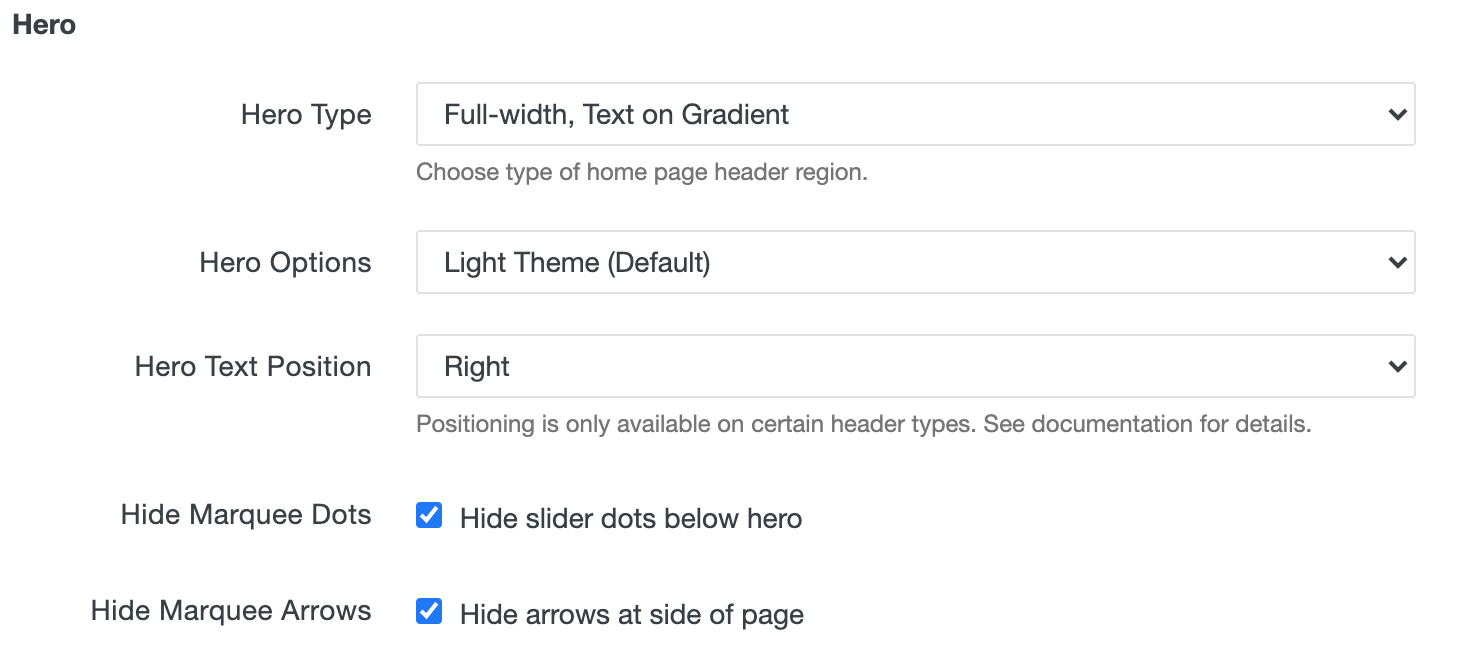
The hero region uses an Modern Campus CMS LDP gallery asset. With a multi-image gallery, you can choose to hide the marquee dots or arrows. To use multiple images in the hero, simply upload multiple images into the gallery. All images should be the same size, and you would use the EXACT SAME text for each image.
Hero Image Specs
- Large Image Size: 1960 x 700 (for full-width - most common)
- Small Image Size: 960 x 380 (for inset - less common)
Home Page Gallery images should be cropped to this size or can be larger, as long as they maintain a 2.8 : 1 aspect ratio.
Note: If you choose 'Shorter Height' when configuring the Hero Region options, the image depth will be trimmed at the top AND the bottom to a height of 400 pixels, so figure 50 pixels will be removed from top and bottom. Be aware of that when selecting images for the Hero Region and deciding whether to use 'Shorter Height.'
Hero Types
The following hero types are available, see examples below. Note that if you do NOT want a image here, select 'None' from the dropdown.

Full-width, Horizontal Text
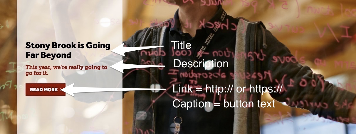
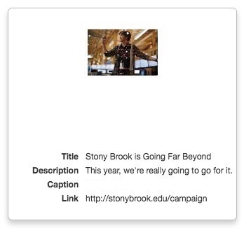
Example setup of LDP Gallery item:
Full-width, Vertical Text

Example setup of LDP Gallery item:

This option can be positioned left (default), center and right.


Full-width, Text on Gradient
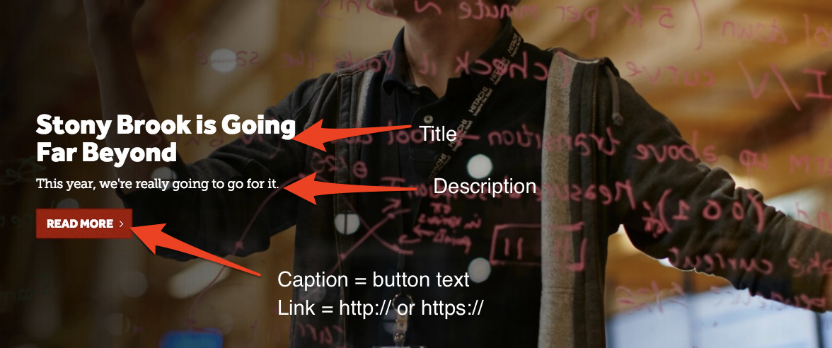
Example setup of LDP Gallery item:
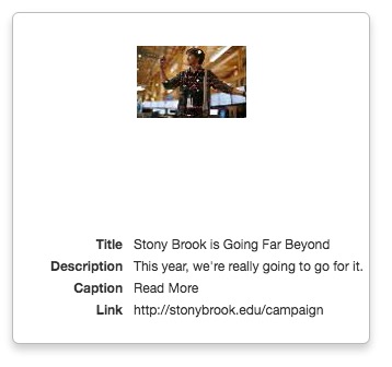
This option can be positioned left (see above) and right:

Inset Image, Text Under
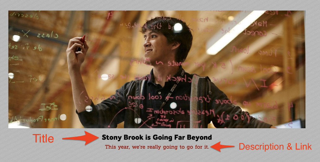
Example setup of LDP Gallery item:

