1 - Column Sponsor Logo
This component allows you to have a sponsor image accompanied by text, with several options for padding, borders, and margins (top/bottom)
How to Use
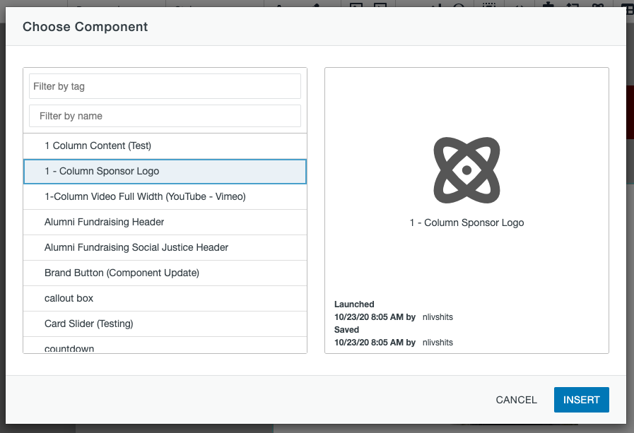
1) Click the "Insert Component" button as seen below, choose the "1 - Column Sponsor Logo" component and click the Insert button.


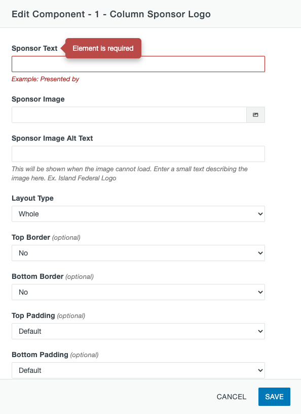
2) The following modal should pop up once you click the Insert button:
3) Enter desired text in the 'Sponsor Text' field
4) Locate desired sponsor image by clicking the image-selection icon

5) Enter the alternative text for the sponsor image. This text shows in case the image does not load so the user knows what the image was supposed to be.
6) The border, padding, and margin (top/bottom) fields are completely optional. They are used to adjust the space between the sponsor logo and other elements around it.
7) Click save and publish to view the component
Example of 1 - Column Sponsor Logo

